![]() Within a decade, 300,000 megawatts of unsubsidized local solar power could compete with utility electricity prices in almost every state, enough clean energy to produce 10% of U.S. electricity. Grid parity is building like a relentless wave, but how much solar is at parity today? In 2016? In 2020? On homes or businesses? With incentives or without?
Within a decade, 300,000 megawatts of unsubsidized local solar power could compete with utility electricity prices in almost every state, enough clean energy to produce 10% of U.S. electricity. Grid parity is building like a relentless wave, but how much solar is at parity today? In 2016? In 2020? On homes or businesses? With incentives or without?
Answer all of these questions with the Greatest, Most Interactive U.S. Solar Grid Parity Map from the Institute for Local Self-Reliance. Click the link or the map image below to interact.
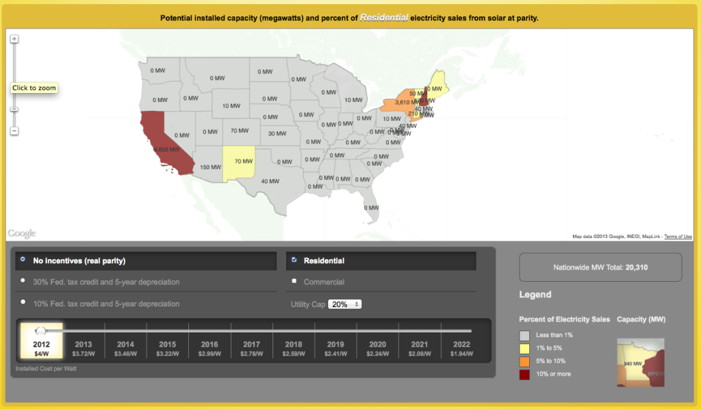
For more on the data behind the map, see ILSR’s Rooftop Revolution resources.