
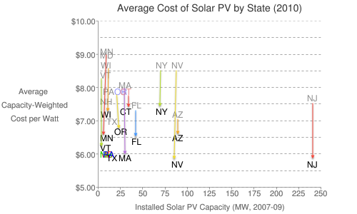
In January, I plotted the size of state solar markets against their average installed cost and found surprisingly little correlation. When Lawrence Berkeley Labs put out their 2011 version of Tracking the Sun (IV), it was possible to update the chart, which I did in two stages.
The first chart simply overlays the 2010 average installed cost on the original chart, with arrows indicating the movement of the prices in most states (I ran out of room in the small market states). It’s almost like a rainbow rain of falling solar prices.
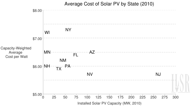
The next chart updates the original one, plotting average cost against the market size, with data from 2010 for both metrics. California was omitted because its market is orders of magnitude larger than the rest, although it’s average installed cost of $6.30/Watt was not the lowest.
It seems that the falling cost of solar nationwide has also compressed the cost spread between states, at least for larger markets. To make the chart more legible, I left off data from some small markets that indicates there’s still a lot of variation (an average cost of $10/Watt in Illinois with a solar market size of 16 MW, for example; or $8.50/Watt in Utah, with a total market of 2 MW).
That there can still be a difference of more than $4.00 per Watt in average installed costs between states is rather disturbing. It’s also problematic that market size doesn’t necessarily help drive down costs on small-scale systems – despite being the two largest solar markets, installed costs for small-scale solar (10 kW and smaller) in New Jersey and California are in the middle of the pack.
The authors of Tracking the Sun IV do an admirable job of trying to account for the disparity in system costs for small-scale PV, and many of the comments would apply to the solar market more broadly:
Differences in average installed costs across states may partially be the result of the differing size and maturity of the PV markets, where larger markets stimulate greater competition and greater efficiency in the delivery chain, and may also allow for bulk purchases and better access to lower- cost products. That said, the two largest PV markets in the country (California and New Jersey) are not among the low-cost states. Instead, the lowest cost states (New Hampshire, Texas, Nevada, and Arkansas) are relatively small markets, illustrating the influence of other state or local factors on installed costs.
For example, administrative and regulatory compliance costs (e.g., incentive applications, permitting, and interconnection) can vary substantially across states and localities, as can installation labor costs. Average installed costs may also differ among states due to differences in average size or differences in the proportion of systems that are ground-mounted or have tracking equipment, which will tend to increase total installed cost. Average reported installed costs may also be higher in states where a greater proportion of systems are owned by third parties, for reasons explained in the following section – though, in that case, the cost differences would be more an artifact of how installed costs are reported for third-party systems than a result of any difference in underlying installation costs.
Clearly, the growth of solar has led to dramatic declines in the installed cost across the country. But it remains to be seen if market maturity leads to a reduction in the significant price differences between states and to significant price decreases for small-scale solar.